Temperature of the Baltic Sea
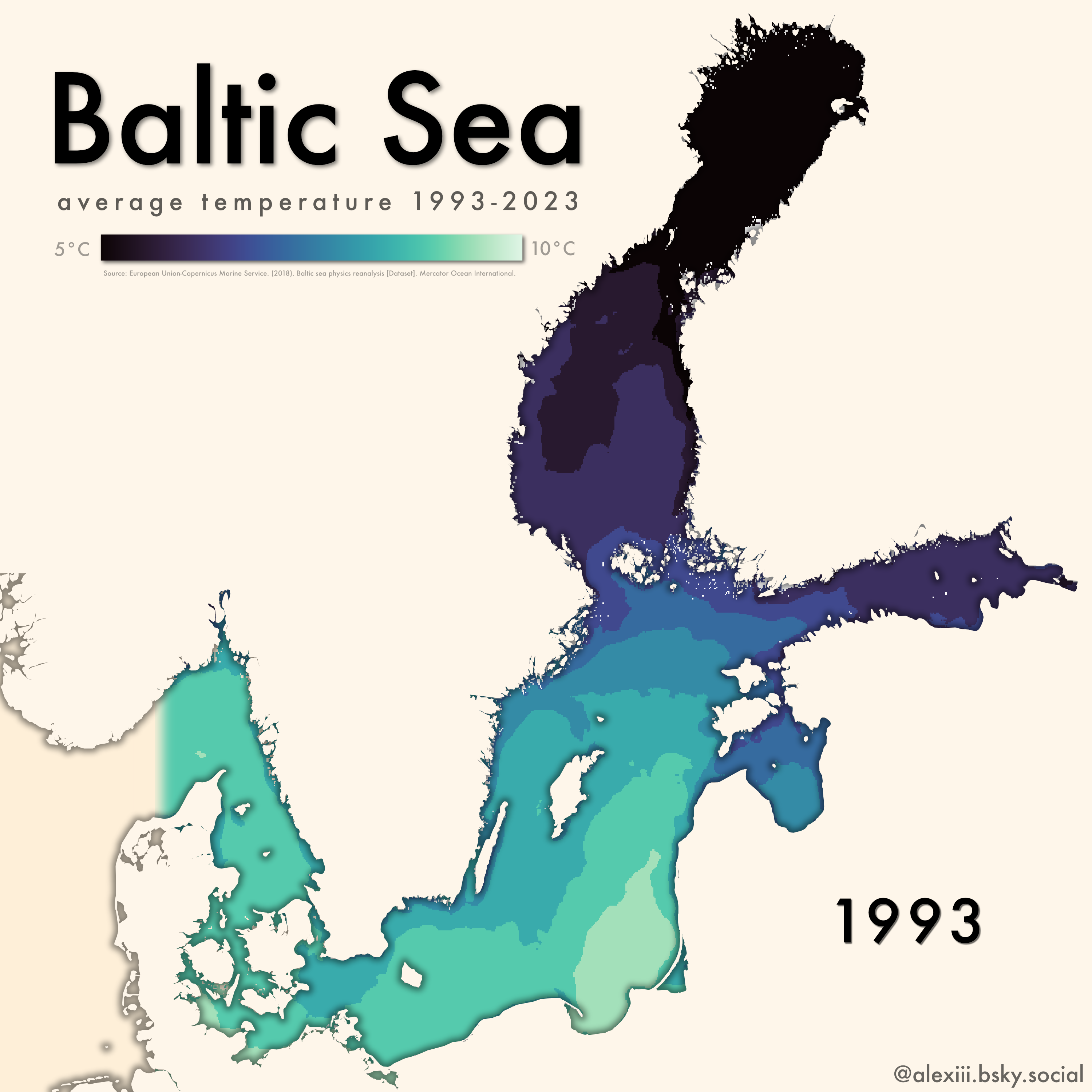
This animated map was made for the day 20 of the #30DayMapsChallenge, for the theme “water”.
A quick explanation of the workflow
I first downloaded the Copernicus dataset “Baltic Sea Physics Reanalysis” (https://doi.org/10.48670/moi-00013).
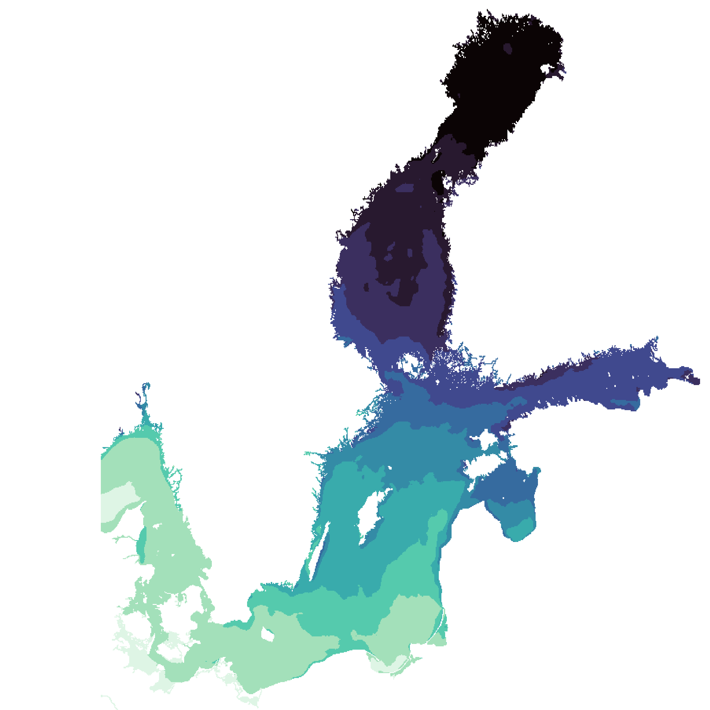
The dataset consists of multiple NetCDF files, for years 1993-2024. I used QGIS to explore the the NetCDF files and reprojected them to EPSG:3035. I used the Temperature (thetao) layer (band 01) for surface temperature. After deciding on a color ramp, I wrote a short python script to export as a png the same layer and band for each NetCDF file (one per year).
The result:
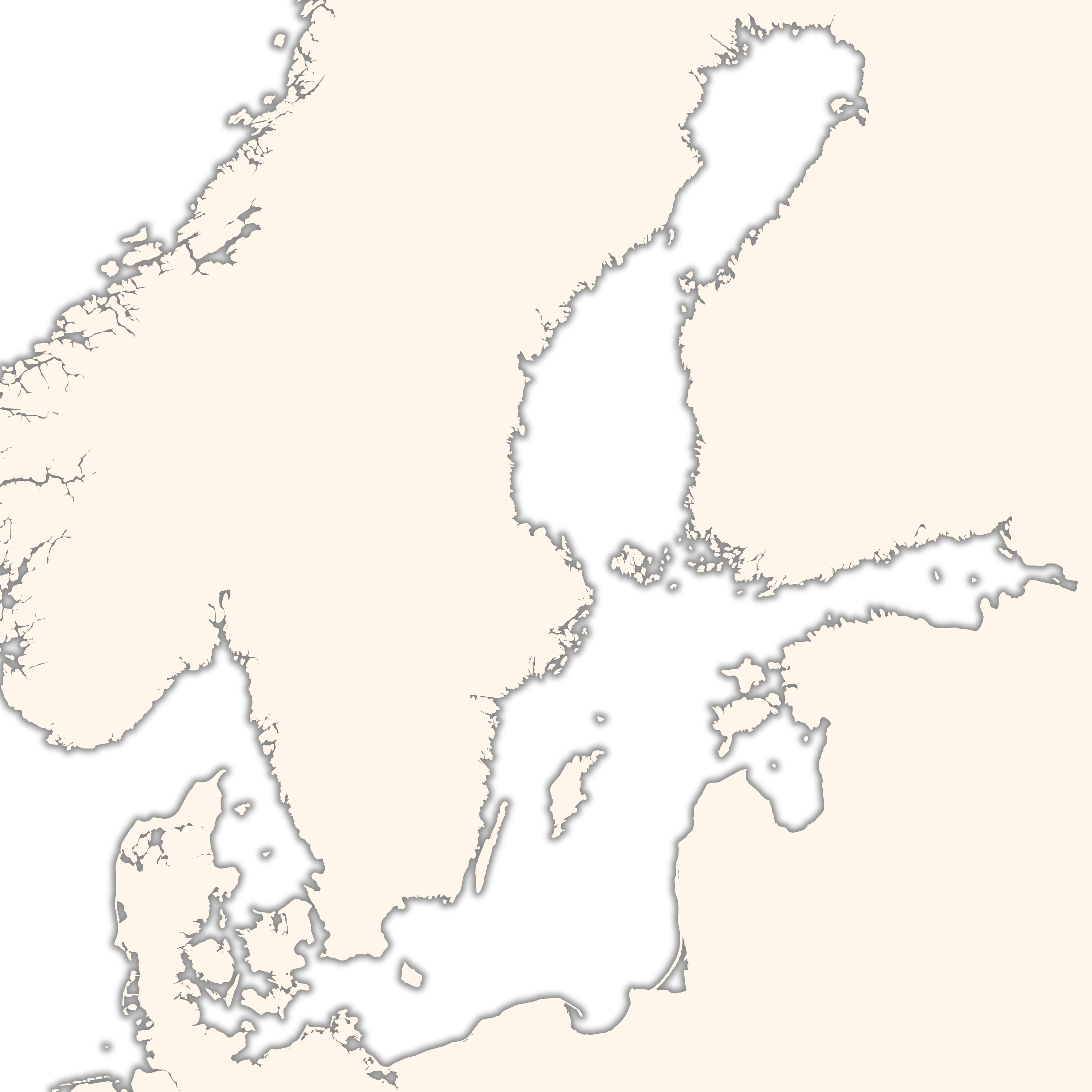
I then styled another layer (natural earth data) to get the country outlines. Final styling was done using Affinity Designer 2, and a png file was created for each year.
Finally, using FFmpeg, I combined every frame into an animation.
Result: